MOBY DICK
Book Redesign
October 2022 - Jan 2023
The design of the book “Moby Dick” is a response to the ISTD commission Open|Close, which aims to radically redesign a copyright-free book, taking into account aspects such as format, paper choice and book architecture as well as typesetting. With an experimental approach to the subject, the book itself is to be expanded and the stories brought to new life (ISTD, 2023). The book chosen for the redesign is “Moby Dick”.
Moby Dick is a book full of different interpretations. The themes covered include race, religion, nature and man, madness, morality, fate and free will, and the human condition itself. Through the use of various writing techniques and rhetorical and non-rhetorical questions, the author challenges the reader’s own way of life and perspective on life itself.
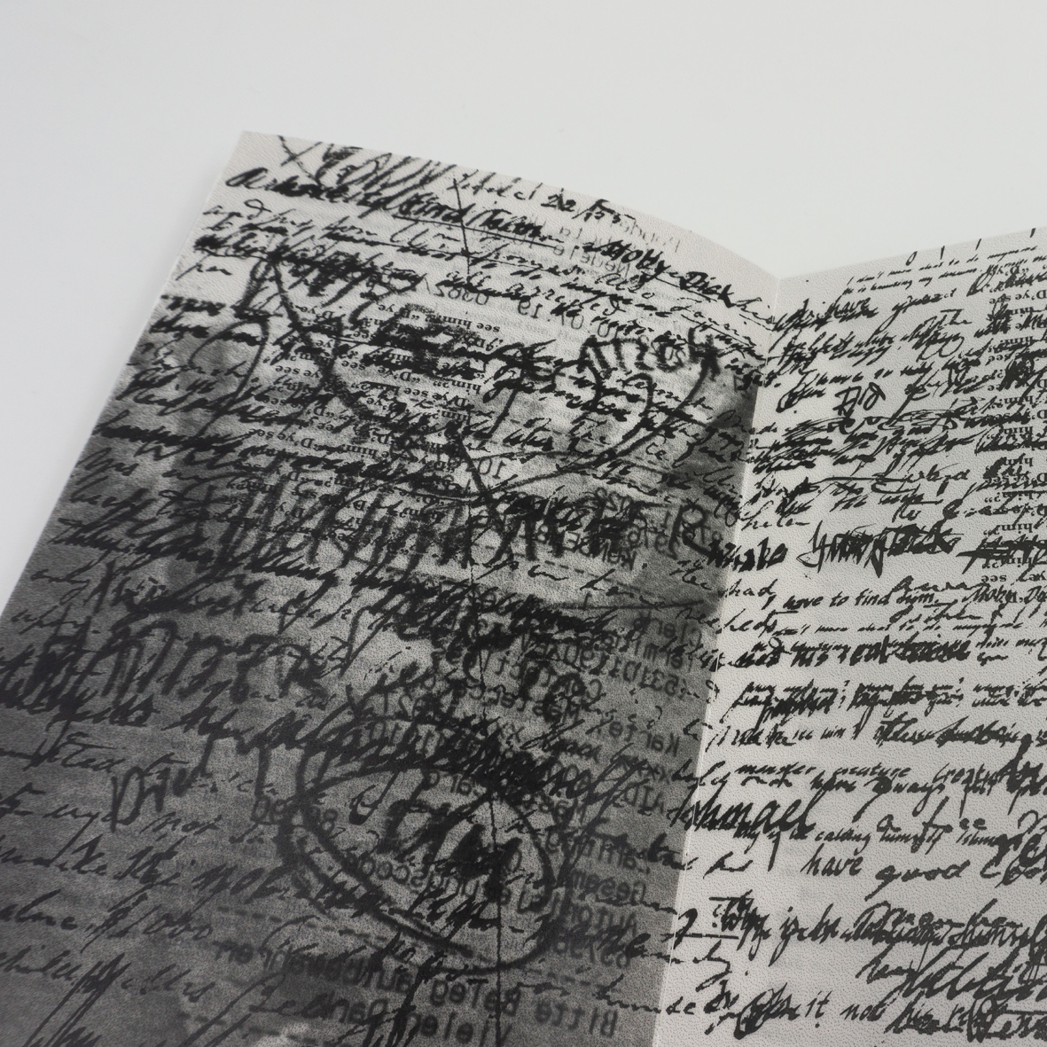
When I started reading Moby Dick, I felt the need to take notes as the text seemed very complicated and hid various meanings, metaphors, etc. I found myself taking notes as I read the text. In doing so, I found myself highlighting various questions and phrases in the book so that I could come back to them later. It was then that I realised that Hermann Melville really engages the reader in his work as he invites them on a journey through the whaling industry and life. Even his writing style changes throughout the book as he incorporates different characters, even the whale itself, and the captain starts to sound like Shake- speare when the obsession is at its peak.
The target audience is people between the ages of 25 and 45 who have read Moby Dick as part of their studies or have always refused to read it because they couldn’t see behind the scenes of a novel about whaling and the desire to hunt down this great monster once and for all. They are now open to see the bigger picture and to question their standards and perspectives in life.
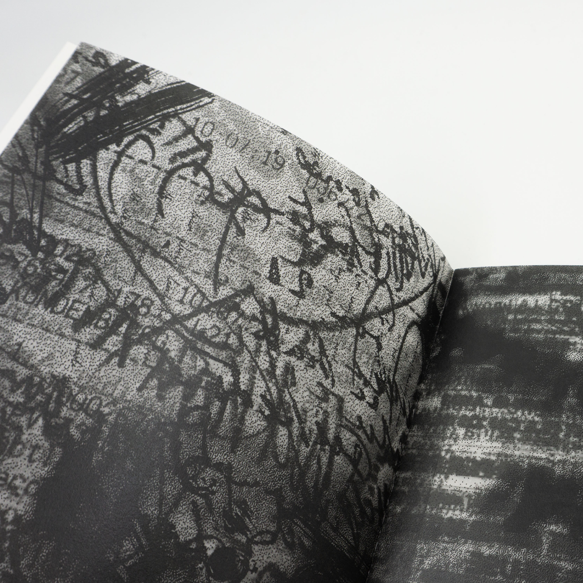
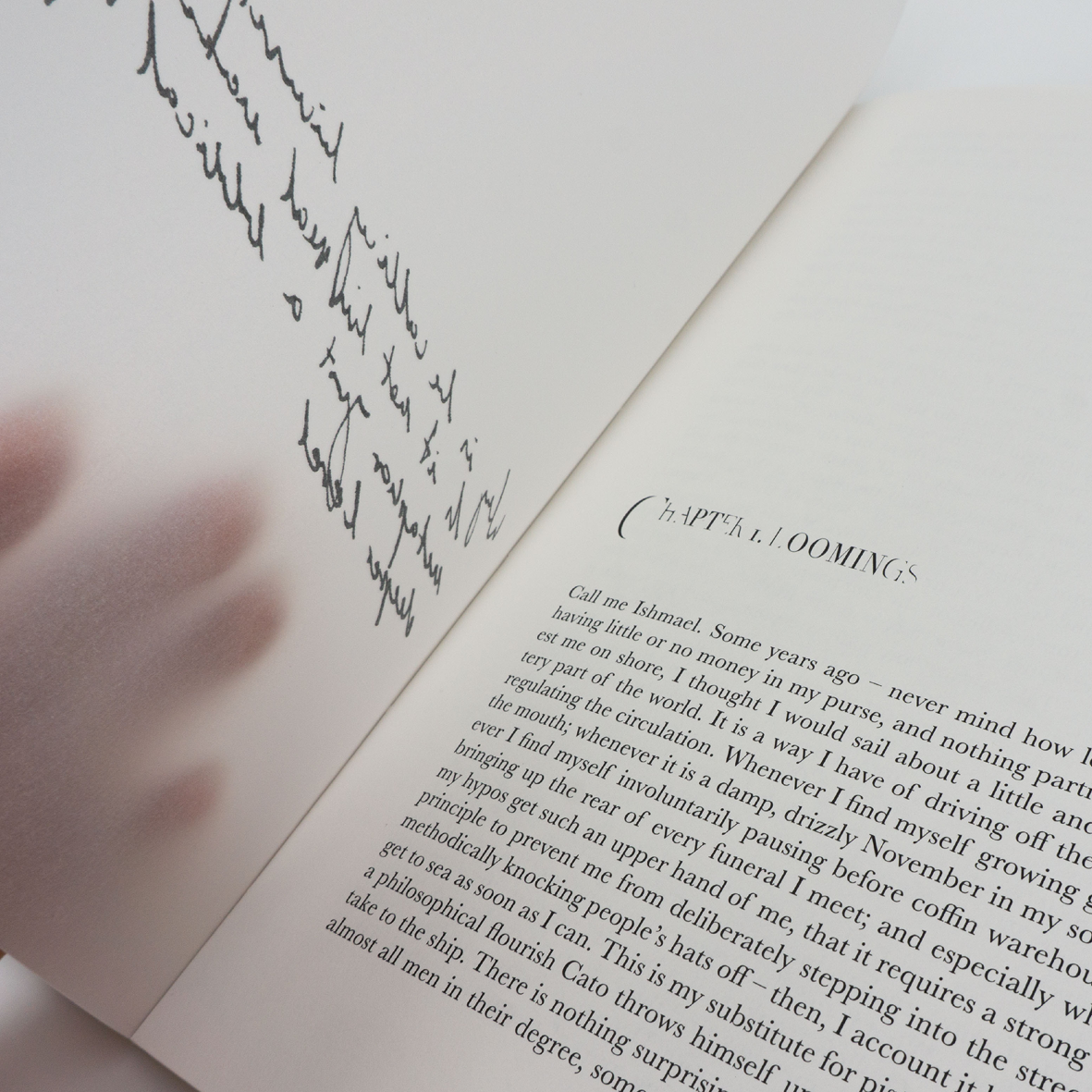
The concept of perspectives and the author questioning the reader’s way of thinking is represented by the overlay of transparent pages on the book. These transparent pages show the thoughts of the person reading the book as well as those of the captain who is slowly going insane. With the added tracing paper, which gains weight as the book progresses, the design becomes even more layered and messy to show the thoughts and obsessions that build up to the climax of the book. The clear handwritten thoughts of the first chapter turn into quick scribbles and ink blots that render the notes illegible.